The Geographic Imaginary of ManAir
Beyond showcasing specific sites for tourism, ManAir illustrated how the Manchuria Aviation Company imagined the broad expanse of its aerial domain.
What are some of the countries that ManAir represented on its covers?
What spatial arguments might ManAir have promoted with these covers?
These covers de-centered the home islands within the Japanese empire, many of them instead emphasizing Manchuria or Korea as its pivot. Yet as the company expanded its operations, it commemorated new international relationships with foreign airlines. Notice how the covers feature Trans World Airlines and Deutsche Lufthansa, through collages of luggage stickers, airplane schedules, and vacation posters. The Manchuria Aviation Company sought these connections to gain acceptance on the world stage, when Manchukuo itself was also struggling with issues of legitimacy as a client state.
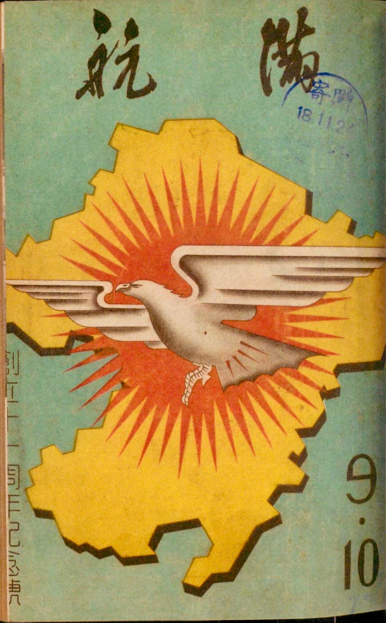
ManAir further reinforced the bounded, territorial existence of Manchukuo by transforming the shape of the country into an identifiable and reproducible logo (much like Italy's boot and France's hexagon), or what Thongchai Winichakul calls a “geo-body” (Winichakul 1994). Manchukuo's “geo-body” helped naturalize what had been a region illegitimately seized by the Kwantung Army. Rather, the “geo-body” reified Manchukuo as a fixed, timeless entity, one that had always been separate from the rest of China.